Lightfastness test
Six
month ago (2015) I made color charts for four of my colored pencils. The four brands I
put to this test where Tombow Irojiten, Lyra Rembrandt Polycolor, Bruynzeel
design and Uni Pericia. This lightfast test is performed by me and is therefore
not to consider as a professional test; it is merely a test of an amateur.
I made my
color charts on Fabriano paper. The paper hade a bit of a tooth, which probably
was a mistake, because if I had chosen a smoother paper I would have hade
better covering and it would have been easier to se the color changing. I covered half of the color chart (which leaved a mark in the middle) so that I can see
the result side by side. I hanged my color chart in a window facing north and
they hanged there for six months (from February 1 to August 1). The summer sun
here in Sweden (where I live) has been scarce this year, it has rained a
lot.
 |
| Lightfastness test |
The color
charts of Tombow and Lyra have only a few colors (I do not own that many).
I do however
have all Bruynzeel and Uni.
Since I wrote this, back in 2015, I have bought all remaining Lyra. I have also done lightfastness test on them.
Since I wrote this, back in 2015, I have bought all remaining Lyra. I have also done lightfastness test on them.
Tombow Irojiten
I only own
few of them and they are all in a lilac color family (which is a sensitive
color) so therefore the result may not reflect the brand overall. However, this
was the worst of them all. After only a couple of months (in winter time and
north direction) the colors where hardly visible.
Lyra Rembrandt Polycolor
I tested
thirteen colors, five were gray, four were pink-reddish colors, and three were
green and one brown. In this color chart I had used some paint thinner in the middle,
so that half of the swatch where half covered. It actually made it easier to
see the result. All of the gray pencils hold their original color. The “raw
umber” was the one that changed the most. The change was however more of a hue
change than a value. Also the “light flesh” had a slight change in color, going
from a pinkish tone to a more yellowish tone. Otherwise all the other colors
hold the test. Read more about Lyra here:
 |
| Lyra Rembrandt Polycolor |
 |
| Lyra light flesh |
 |
| Lyra raw umber |
Bruynzeel design
There where
only two that had great changes. Number 71, a pink color that became much
lighter and number 77, a blue color that also faded much. Smaller changes where
found in number 70, 75, 23, 36, 31, 18, and 11. The changes were however only
slightly noticeable. Nr 16 did not change value but had a hue change, from
orange to more peach.
Of the 48
colors in total ten did not past the test.
 |
| Bruynzeel design lightfastness test |
 |
| Bruynzeel nr 77 |
 |
| Some of the slightly changes colors |
 |
| Bruynzeel nr 71, changed the most |
Uni Pericia
They only
carry a set of 36 colors. Five colors had a change of hue. The “brown
ochre” changed the most. It went from a warm brown to a colder, more like a
“raw umber”. “Gold ochre” also had a
noticeable change, if not as obvious. It went from warmer, reddish ochre to a
more yellowish tone. The third color, “Cobalt blue”, faded just barely and lost
a little of its former lilac tone to a duller one (so again, the red tone where
lost). But it is barely noticeable. The same is true for "Apple green" and especially "Brick red", "Apple green" lost a little bit of the yellow tint and "brick red" become slightly colder. All the other colors where preserved beautifully.
 |
| Uni Pericia |
 |
| Uni Pericia |
 |
| Uni Pericia |
 |
| Uni Pericia Cobalt blue |
 |
| Uni Pericia Brick red |
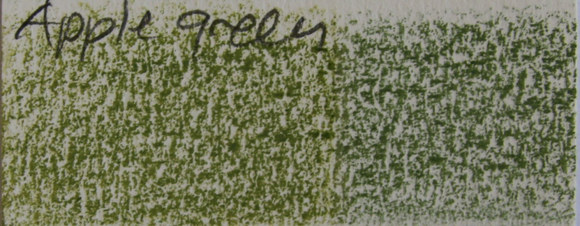 |
| Uni Pericia Apple green |
 |
| Uni Pericia Gold ochre and Brown ockre |